

The New Dolphin
The Dolphin, that was adopted by the Redcliffe rugby league club in the 1960s, has become one of Queensland's biggest sporting brands despite only now being shone under the national spotlight.
The club has gone to extraordinary lengths to protect the brand that is synonymous with rugby league in Queensland, and now has gained a new audience with Australian and global sporting fans.
By reimagining the team's defining red-and-white colours and its heritage logo, the Dolphins NRL team will showcase the illustrious legacy and spirit of one of Queensland's most successful rugby league teams to new audiences and die-hard fans alike.
Our Colours
Red

The traditional Red, synonymous with the Dolphins story since 1947, pays homage to the Club's long and pioneering history, and the players and supporters that have proved to be the Club's true colours to this day. It speaks to the famous run-on sides that have gone before us, the red-hued cliffs of the Redcliffe Peninsula, and the memorable sunsets that are possible when gazing back west over Moreton Bay. It ties us to our land and our Indigenous brothers and sisters, Ningi Ningi people who knew the Redcliffe Peninsula as Kau-in-Kau-in, which means 'Blood-Blood' ('red-like blood') in their local dialect in reference to the red ochre. No matter where the future takes us, the blood red binds us to a sense of common purpose, permanence, and place that dares us to succeed.
Gold

The new Gold speaks to the future horizons for the Dolphins ' the new wealth of trophies we will win and our new supporters who will find a home in the Dolphins' expanding family. The gold represents the sun and the breaking of a new dawn heralding the Club's expectant achievements at national level. The golden sun interwoven into our traditional colours aptly reflects our new Dolphins' family in the communities of the Sunshine Coast, Moreton Bay, Brisbane, and right across the Sunshine State. Unparalleled in the National Rugby League, the Dolphins are bold enough to claim that it is the colour of shimmering gold that defines us, not our competitors. We have the confidence, the optimism, and the vision to claim that we have a right to compete and be worthy of gold. Our first NRL season will surprise many, but not those of us who have always believed that this is our destiny.
White

The neutral White is the fresh canvas full of possibility that lies before us. Inspiring a sense of potential and a call to design our own destinies, connecting our past to our future. For the Dolphins, white represents our associations, juniors, QRL feeder clubs, and grassroots community partnerships that embody all that makes us great. They are the reason we run out on the pitch each weekend - to inspire the next generation of young boys and girls to play rugby league. White highlights the mud, stain, and occasional blood that comes from playing the mighty game of Rugby League with the grit that the Dolphins are famous for. The Club that gave us fearless rugby league legends likes of Arthur Beetson, Ian Pearce, and Petero Civoniceva would not have it any other way.
The Leaping Dolphin
The dolphin traditionally represents harmony, peace, cooperation, and balance. The playful nature of the dolphin is also a reminder that we should promote our game of rugby league with a sense of joy. We have adopted this approach to the way we are creating our club culture and in building unique game day experiences for our fans.
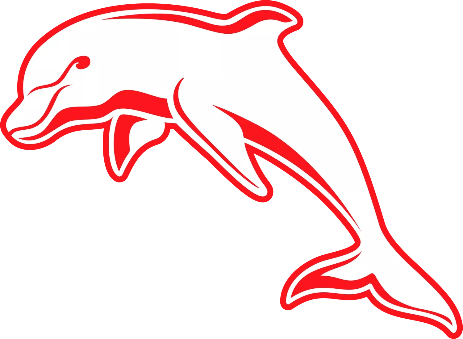
An Iconic Symbol
Inspired by the iconic Redcliffe Dolphins founded in 1947, the new dolphin pays homage to the past while recognising a contemporary global sporting trend towards classic symbolism and clean modern design that echoes history. The design recognises the significance of being more than simply a club logo, but rather, a brand.
The Wave Fin
The fin reflects the form of a wave to incorporate the region's coastal landscape into the design. An undulating wave pattern emerges as additional branding material integrating the logo into supplementary design.
Red, Gold & White
The logo series incorporate the three primary colours of the team, with red and white inspired by the original Redcliffe Dolphins and the famous red cliffs of the landscape as well as the new hero colour, a sand gold. It was designed with an alternate direct inversion of colours, creating a versatile and contemporary brand.
Facing the Future, Facing the Heart
The new dolphins charges into the future, with a strong but optimistic gesture. On our club jersey, it leaps towards the heart. The dolphin, a symbol of rebirth, propels itself out of the water just as this new team rises from the heartland of Australian Rugby League. Its forceful stance communicates the strength of the athletes while also conveying a sense of protection, another meaning of the dolphin symbol. The design is powerful but not overtly masculine in order to fully represent the people of the region, inclusive of all the Dolphins family.
Historic Typography
Inspired by the iconic jerseys of the Redcliffe Dolphins, the primary Dolphins logo typography interprets the classic Village Motors sponsor logo that has been synonymous with the dolphins. The typography adopts a classic sport form with geometric angles which was modernised with an outline drop-shadow representing the team emerging from the past. The text has an arc form mirroring the surf surrounding the coast.
The new clean lines and striking simplicity of the leaping dolphin is the club's new visual identity. It is the symbol of our aspirations and ambitions for the Club - to leap beyond our competition, both on and off the field.
Similarly our new colours will join the traditional red and white of the Dolphins teams of the past and add a gold colour that will represent our new beginning and the future glories ' and trophies - the Dolphins will chase and attain.
